Android Design etiketine sahip kayıtlar gösteriliyor. Tüm kayıtları göster

3 Haziran 2014 Salı

An Android Wear Design Story

By Roman Nurik and Timothy Jordan, Design and Developer Advocates on Android Wear

A few weeks ago, Timothy and I were chatting about designing apps for wearables to validate some of the content we’re planning for Google I/O 20141. We talked a lot about how these devices require scrutiny to preserve user attention while exposing some unique new surface areas for developers. We also discussed user context and how the apps we make should be opportunistic, presenting themselves in contexts where they’re useful; it’s more important than ever to think of apps on wearable devices not as icons on a grid but rather as functional overlays on the operating system itself.


But while I’d designed a number of touch UIs for Android in the past and Timothy had a ton of experience with Glass, neither of us had really gone through the exercise of actually designing an app for Android Wear. So we set out to put our ideas in practice and see what designing for this new platform is like.


Before we got started, we needed an idea. Last year, I participated in an informal Glass design sprint in NYC run by Nadya Direkova, and my sprint team came up with a walking tour app. The idea was you’d choose from a set of nearby tours, walk between the stops, and at each stop on the tour, learn about the destination.


My rough mocks of a walking tour app from a Glass design sprint.


While the design sprint ended at rough mocks, the idea stuck around in my mind, and came up again during this exercise. It seemed like a perfect example of a contextually aware app that could enhance your Android Wear experience.


Designing a walking tour app for Android Wear


We started fleshing out the idea by thinking through the app’s entry points: how will users “launch” this app? While exposing a “start XYZ walking tours app” voice command is pretty standard, it’d be interesting to also suggest nearby walking tours as you go about your day by presenting notifications in the user’s context stream. These notifications would be “low priority,” so you’d only see them after addressing the more important stuff like text messages from friends. And with today’s geofencing and location functionality in Google Play services, this type of contextual awareness is possible in a battery-friendly way.


At this point we were pretty excited and decided to begin mocking up the UI. Rather than starting from scratch, we used Taylor Ling’s excellent Android Wear 0.1 design template as a baseline, which includes templates for both square and round devices. We started with square since we were most familiar with rectangle UI design:


Idea: You get a notification in the context stream when a walking tour is available nearby.


I’ve got to admit, it was pretty thrilling designing in such a constrained environment. 140x140 dp (280x280 px @ XHDPI) isn’t a lot of space to work with, so you need to make some tough choices about when and how to present information. But these are exactly the types of problems that make design really, really fun. You end up spending more time thinking and less time actually pushing pixels around in Photoshop or Sketch.


We pretty quickly fleshed out the rest of the app for square devices. They included just a handful of additional screens: a dynamic notification showing the distance to your next stop, and a 4-page detail screen when you arrive at the tour stop, where you can spend a few moments reading about where you’re standing.


A notification guiding you to your next stop, and a multi-page stop detail screen for learning about the stop when you get there.


Seeing our design in real life


Here’s the thing—there’s only so much you can do in Photoshop. To truly understand a platform as a designer, you really need to use (and ideally live with) a real device, and see your work on that device. Only then can you fully evaluate the complexity of your flows, the size of your touch targets, or the legibility of your text.


Luckily, Timothy and I both had test devices—I sported an LG G Watch prototype and Timothy carried a Moto 360 prototype. We then needed a way to quickly send screens to our devices so we could iterate on the design. A few years ago I’d published the Android Design Preview tool that lets you mirror a part of your screen to a connected Android device. Much to our delight, the tool worked great with Android Wear! After seeing our mocks show up on my LG G Watch, we made a few small tweaks and felt much more confident that the overall idea “felt right” on the wrist.


Android Design Preview mirrors a part of your computer screen to an Android device. It’s especially awesome seeing your UI running on an LG G Watch prototype.


Designing for round devices


We’d never designed round UIs before, so we weren’t sure what this new adventure would be like. Quite frankly, it ended up being unbelievably easy: tweaking all 8 of our screen mocks for round took under an hour. When you’re only showing the most important 2 or 3 pieces of information on screen at a time, that’s only 2 or 3 pieces of information you need to optimize for round devices. All in all, there were only a few types of minor tweaks we made:


  • Scaled up backgrounds to 160x160 dp (320x320 px @ XHDPI)

  • Bumped up content margins from 12dp on square to 26dp on round; this means content was 116x116 dp on square and only a little smaller at 108x108 dp on round

  • Pushed down circular actions like “Continue tour” to better vertically center with the watch frame

  • Center-aligned certain short snippets of text on round devices as opposed to left-aligning on square

  • Dropped the side padding for context stream cards (the platform automatically does this for notifications, so there isn’t any actual work to do here)


These weren’t completely different layouts—rather, the same layout with slightly tweaked metrics.


It’s hard to articulate the excitement we felt when we mirrored the mocks to Timothy’s Moto 360 prototype with Android Design Preview. To put it lightly, our minds were blown.


There’s something special and awe-inspiring about seeing one of your UIs running on a round screen..


And that was it—with round and square mocks complete, and mirrored on our devices, we’d gotten our first glimpse at designing apps for this exciting new platform. Below are our completed mocks for the tour discovery and engagement flows, not a grid of app icons in sight. You can download the full PSDs here.


An eye-opening experience


Designing for Android Wear is pretty different from designing for the desktop, phones or tablets. Just like with Glass, you really need to think carefully about the information and actions you present to the user, and even more so about the contexts in which your app will come to the surface.


As a designer, that’s the fun part—working with constraints involving scarce resources like device size and user attention means it’s more important than ever to think deeply about your ideas and iterate on them early and often. The actual pixel-pushing part of the process is far, far easier.


So there we were, putting our ideas into practice, on real actual device prototypes that we could’ve only dreamed about only a few years ago. It was the most fun I’ve had designing UIs in a long time. Remember that feeling when you first dreamed up an app, mocked or even coded it up, and ran it on your Android phone? It was that same feeling all over again, but amplified, because you were actually wearing your app. I can’t wait for you all to experience it!


1 Have we mentioned #io14 will have tons of great content around both design and wearable computing? Make sure to tune in June 25th and 26th!


26 Aralık 2013 Perşembe

The Beautiful Design Winter 2013 Collection on Google Play

Posted by Marco Paglia, Android Design Team


While beauty’s in the eye of the beholder, designing apps for a platform also requires an attention to platform norms to ensure a great user experience. The Android Design site is an excellent resource for designers and developers alike to get familiar with Android’s visual, interaction, and written language. Many developers have taken advantage of the tools and techniques provided on the site, and every now and then we like to showcase a few notable apps that go above and beyond the guidelines.


This summer, we published the first Beautiful Design collection on Google Play. Today, we're refreshing the collection with a new set of apps just in time for the holiday season.


As a reminder, the goal of this collection is to highlight beautiful apps with masterfully crafted design details such as beautiful presentation of photos, crisp and meaningful layout and typography, and delightful yet intuitive gestures and transitions.


The newly updated Beautiful Design Winter 2013 collection includes:


Timely (by Bitspin), a clock app that takes animation to a whole new level. Screen transitions are liquid smooth and using the app feels more like playing with real objects than fussing around with knobs and buttons. If you’ve ever wondered if setting an alarm could be fun, Timely unequivocally answers “yes”.


Circa, a news reader that’s fast, elegant and full of beautiful design details throughout. Sophisticated typography and banner image effects, coupled with an innovative and "snappy" interaction, makes reading an article feel fast and very, very fun.


Etsy, an app that helps you explore a world of wonderful hand-crafted goods with thoughtfully designed screen transitions, beautifully arranged layouts, and subtle flourishes like a blur effect that lets you focus on the task at hand. This wonderfully detailed app is an absolute joy to use.


Airbnb, The Whole Pantry, Runtastic Heart Rate Pro, Tumblr, Umano, Yahoo! Weather… each with delightful design details.


Grand St. and Pinterest, veterans of the collection from this summer.


If you’re an Android developer, make sure to play with some of these apps to get a sense for the types of design details that can separate good apps from great ones. And remember to review the Android Design guidelines and the Android Design in Action video series for more ideas on how to design your next beautiful Android app.


19 Temmuz 2013 Cuma

Making Beautiful Android App Icons

Posted by Roman Nurik, Android Developer Relations


For most users, the launcher icon (sometimes referred to as the app icon) is the first impression of your app. As higher density screens on both phones and tablets gain popularity, it's important to make sure your launcher icon is crisp and high quality. To do this, make sure you’re including XHDPI (320dpi) and XXHDPI (480dpi) versions of the icon in your app.

In addition to the current launcher icon guidelines, please also refer to these additional important guidelines when creating your icons:

  • Launcher icons are 48dp square and should be provided for MDPI, HDPI, XHDPI, and XXHDPI densities—at the very least XHDPI and XXHDPI.

  • The 512px Google Play listing icon should have the same content as the launcher icon, except for minor additional badging.

  • Launcher icons should be designed specifically for Android. As per the Pure Android design guidelines, avoid mimicking visual elements and styles from other platforms.

  • Launcher icons should be three-dimensional, front view, with a slight perspective as if viewed from above, so that users perceive some depth.

  • Launcher icons should have a distinct silhouette, meaning that you should avoid simple square/circle icons and instead opt for unique shapes.

  • Launcher icons should be simple at the macro level but still detailed at the micro level (e.g. include subtle edge effects, gradients and textures).

  • Launcher icons should employ lightweight background protection such as a subtle drop shadow, but it should not be too dark or visually prominent.

  • Launcher icons should include between 0dp and 3dp of padding. Vary the padding for optical alignment and weight normalization purposes (e.g. thinner icons can use smaller padding and thicker icons can use less padding for a more consistent icon mass across icons).

Note that tablets and other large screen devices request a launcher icon that is one density size larger than the device's actual density, so you should provide your launcher icon at the highest density possible. For example, if a tablet has an XHDPI screen, it will request the XXHDPI version of the launcher icon.

3 Temmuz 2013 Çarşamba

The Beautiful Design Summer 2013 Collection on Google Play

Posted by Marco Paglia, Android Design Team

Attention to detail makes an app truly beautiful: transitions are fast and clear, layout and typography are crisp and meaningful, and design touches that delight you in surprising ways are sprinkled throughout. Today, we’re publishing a new Beautiful Design collection on Google Play, which highlights 11 beautiful apps with these kinds of masterfully crafted design details.

The collection, which we’ll refresh with new apps every so often, currently includes:

  • Pattrn (by Lucas Rocha), a beautifully focused app for discovering and sharing unique wallpapers on any size screen device.

  • Pocket (by Read It Later), an article keeper and reader app with a beautiful queue browsing interface and a remarkably comfortable and pleasing reading experience on phones and tablets.

  • Timer (by Opoloo), a timer app with an elegant and deeply satisfying timer-creation interface and simple, beautiful theme choices.

  • Eye in Sky Weather, NY Times, Grand St., Pinterest, Press, Expedia, Flipboard and TED… each with delightful design details.

If you’re an Android developer, make sure to play with some of these apps to get a sense for the types of design details that can separate good apps from great ones.

Lastly, remember that this new Beautiful Design collection is just one of a number of unique collections on Google Play that are front and center in the new Google Play Store app client.

26 Kasım 2012 Pazartesi

Designing for Tablets? We’re Here to Help!

Posted by Roman Nurik, who often writes about Android design-related topics on Google+

So you’ve got a great Android phone app on Google Play, your users love it, and you’re kicking back and watching the download numbers soar. Congrats! But like any enterprising developer, you may be thinking, “how do I take my app’s success even further?” The answer: an equally awesome experience on tablets. Users love their tablet apps! For example, Mint.com found that the larger screen real estate allowed tablet users to engage with their budget data 7x more than on phones. And TinyCo found that on average, paying users spent 35% more on tablets than on handsets. So now is the right time to think about how your app translates onto these larger screen devices that are designed to meet users’ more generic, everyday computing needs.

In this post, we’ll recap some of the resources available for crafting a great tablet experience for your users. These resources are useful for everyone in the app development pipeline—from product managers, to designers, to developers, and QA engineers.

Android Design Guidelines

No conversation about Android app design or development should go very far without first consulting the Android Design guidelines. While most of the sections are relevant to all Android devices, certain sections stand out as particularly relevant to design on tablets.

The Devices and Displays page introduces the concept of density-independence. For example, although the Nexus 4, Nexus 7, and Motorola XOOM all have a similar pixel resolution (1280x768, 1280x800, and 1280x800 respectively), they have vastly different screens. Instead of thinking in pixels, think in dips (density-independent pixels)—that way, it’s much easier to conceptualize the difference between Nexus 4 (640x384 dp), Nexus 7 (960x600dp), and Nexus 10 or the Motorola XOOM (1280x800 dp).

Following the 48dp rhythm discussed in Metrics and Grids helps take some of the guesswork out of sizing elements, especially for tablets. When in doubt, use multiples of 48dp (or 16dp for a finer grid) for sizing elements horizontally and vertically. For example, when showing sparse content on larger screens, consider using generous side margins of 96dp or 144dp. Or when deciding how wide your master pane should be in a master/detail layout for 10” tablets, see how your master content looks and feels with a width of 240dp or 288dp.

The Multi-pane Layouts guide discusses use cases and examples for combining related views into a single screen to simultaneously improve app navigation and make optimal use of the available screen real estate. It also discusses strategies for laying out content across both portrait and landscape, all while maintaining functional parity across orientations. Since users enjoy using tablets in both portrait and landscape orientations, it’s even more important to react properly to orientation changes than with phones.

Lastly, the Downloadable Stencils offer designers a great starting point for high-fidelity mockups, complete with reference device outlines, correctly sized action bars, and more.

Android Training for Developers

The Training section of the developer site offers task-oriented technical training material, complete with flow diagrams, code snippets, sample projects and more. Several of these ‘classes’ are geared toward helping developers understand how to scale your apps across any screen size.

The Designing Effective Navigation class—aimed more at the initial design phase of the app creation process—offers a methodology for effectively planning and grouping screens on tablets, and even shows example wireframes for a simple news reader application following this methodology.

The classes Building a Dynamic UI with Fragments and Designing for Multiple Screens demonstrate how to use fragments in conjunction with Android’s resources framework. They show how to easily choose between tablet and handset layouts at runtime while maximizing code reuse and minimizing your application size using resource aliases. They also demonstrate techniques for adapting UI flows based on the current layout.

Lastly, while not precisely a training class, the Supporting Tablets and Handsets document offers even more information about some of these key best practices. And if you’re the type of developer that would prefer to skip the text and jump right into the code, you can even add a Master/Detail flow, complete with handset and tablet support, to your app with just a few clicks using the Android Developer Tools for Eclipse.

Android Design in Action Highlights

Each week, a few of us on the developer relations team get together on the Android Design in Action live show to discuss Android design best practices, as well as provide original ‘redesign’ mockups to help demonstrate our vision of how Android apps should look and feel.

A recent episode focused on the topic of responsive design, or designing flexible apps that can adapt to whatever screen size or form factor they’re run on:

In the episode, we celebrated successful examples of responsive design on Android, ranging from creating calendar events in Google Calendar, to browsing wallpapers and stories in Pattrn and Pocket, to playing video in TED, and finally to managing your conference schedule in the open-source Google I/O 2012 app.

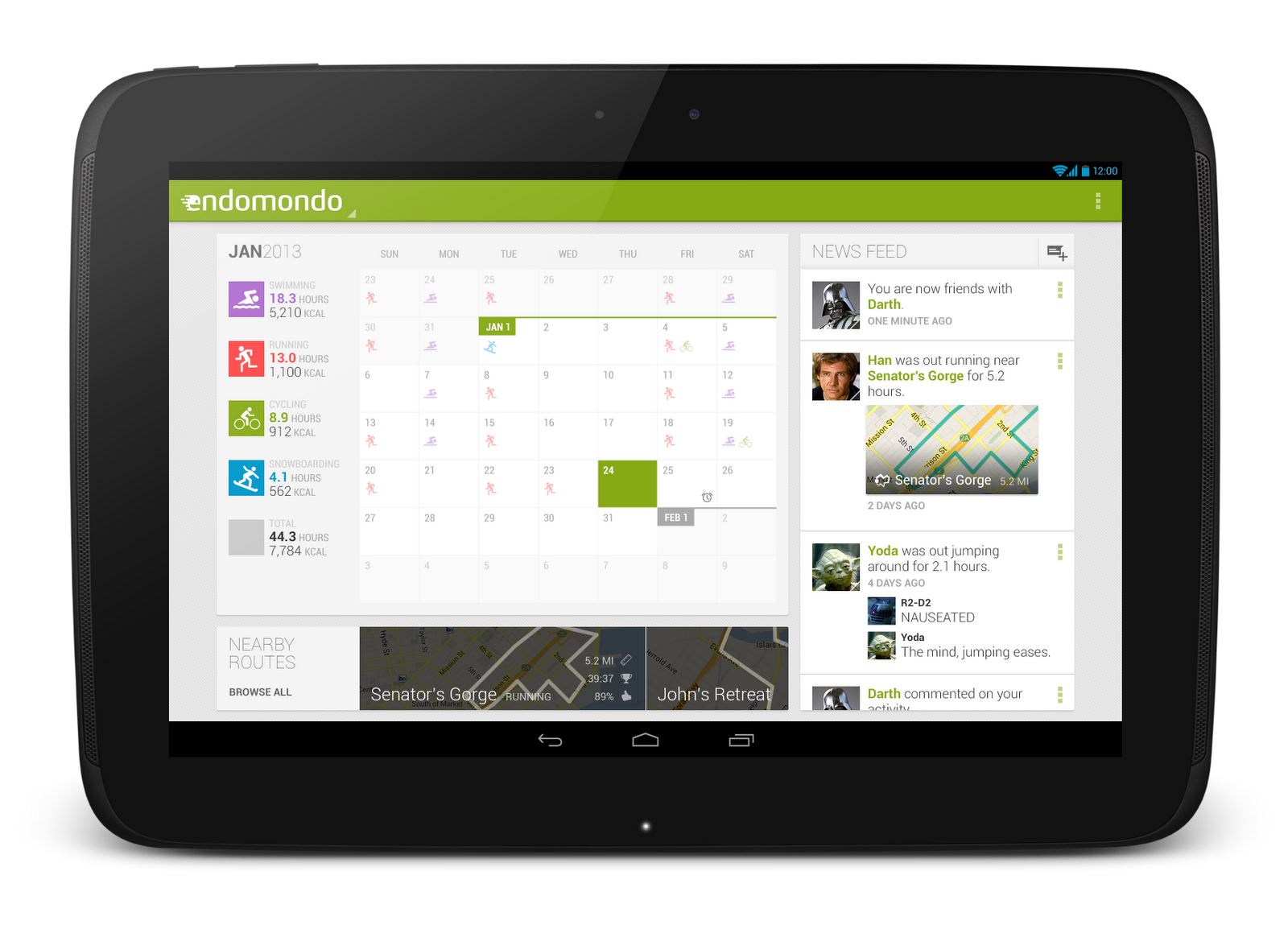
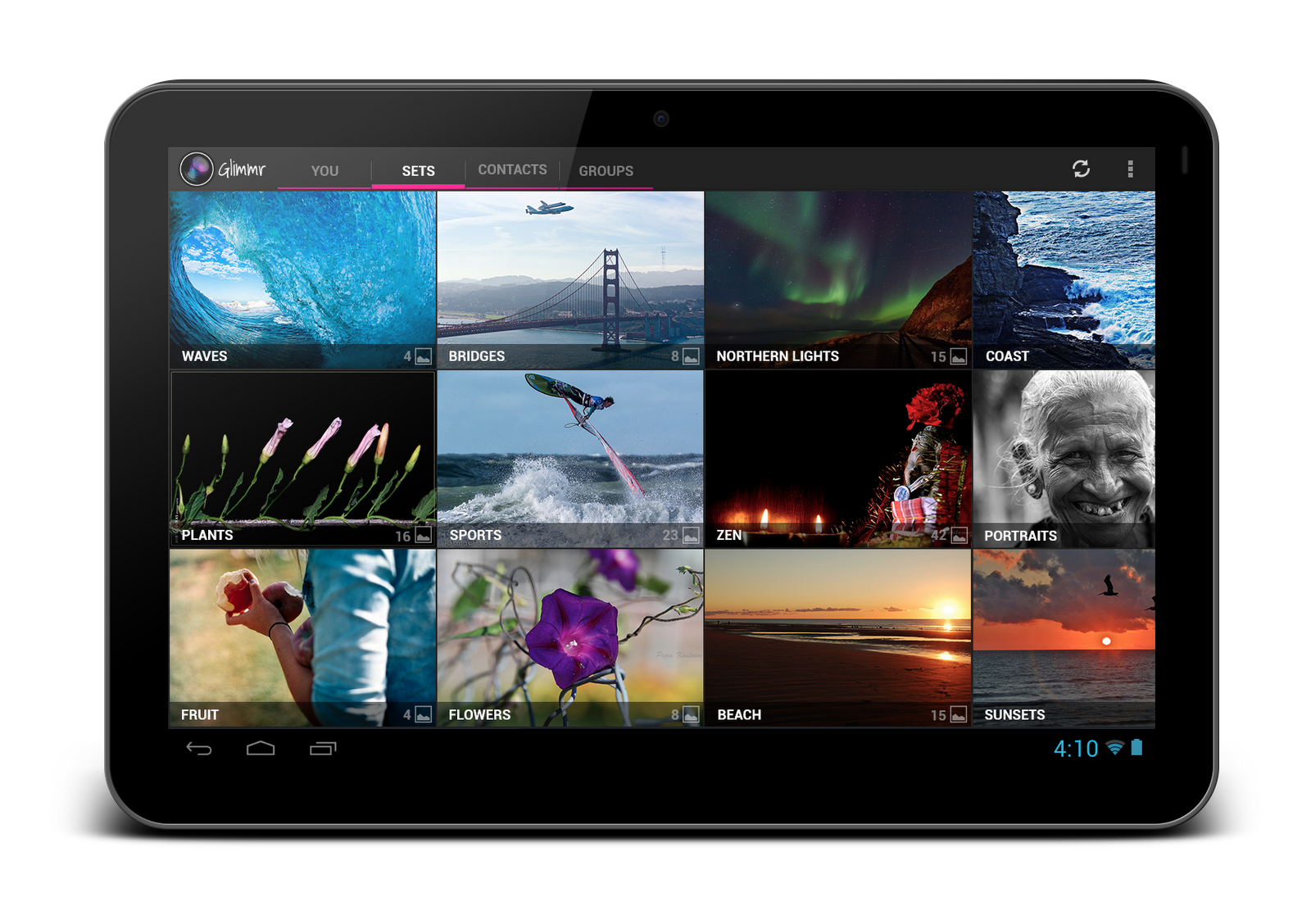
We also regularly feature tablet design concepts on the show (some are shown below), so we highly recommend tuning in each week for design ideas.


For even more tablet app inspiration, check out a few of these apps: Expedia Hotels & Flights, Pulse News, SeriesGuide, Tasks and Timer.

The Tablet Quality Checklist

Over in the “Distribute” section of developer.android.com, the recently published Tablet App Quality checklist is a great way to check if your app is tablet-ready along a variety of technical dimensions. You should make sure that everyone involved in your mobile products is aware of  the standards defined in this checklist, as it is one of the ways in which the Google Play team selects apps to feature in the Staff Picks for Tablets collection.

So What are You Waiting For?

It's been an exciting year for Android tablets. Make sure your app is positioned to succeed in the evolving device landscape by following some of the best practices and examples discussed here and on the rest of developer.android.com.

If you have specific questions about your app, let us know on Google+ (+Android Developers) or Twitter (@AndroidDev)!